how to get away with never wearing heels again: summary and specifics
Flats for every occasion and outfit.
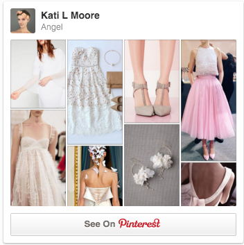
Flats for the 9 types of Fantastical beauty
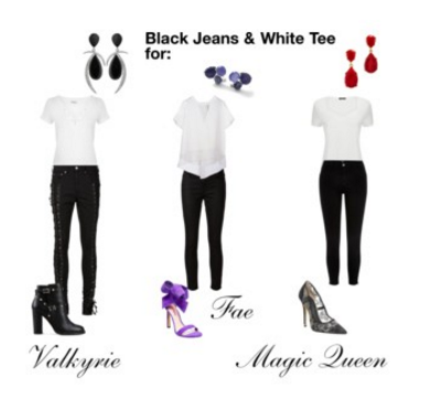
Flats for each of the Base 5 beauty archetypes
Flats for every occasion and outfit.
Flats for the 9 types of Fantastical beauty
Flats for each of the Base 5 beauty archetypes
A quick note on how to handle style advice that conflicts.